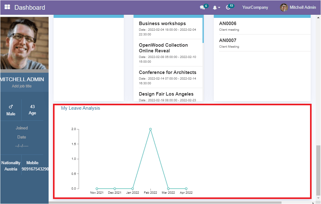
The intuitive system will showcase the leaves analysis of the user in a graphical representation at the bottom of the dashboard window. The line chart represents the leave pattern of the user. By viewing this window, the user will get a clear view of the number of leaves taken during different periods.

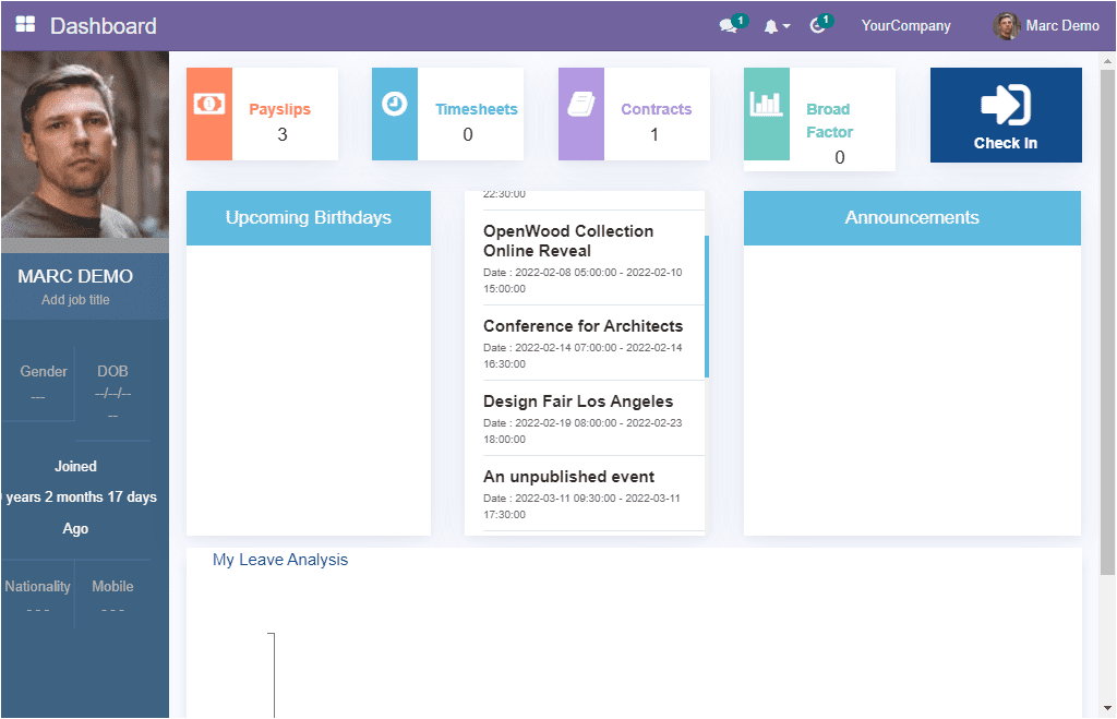
All these options can be viewed when login in as an admin user. If the login is an employee user, they can only able to view their own Payslip, Time Sheet, Contracts, Broad Factor. And only visible the upcoming birthday of the employees of their company, events, announcements and their own leave analysis. for viewing this, let us log in as an employee user. the dashboard of the employee will look like in the image below.

This interactive kind of dashboard will be very effective for the particular users to view all the operations regarding them and all the vital information regarding their company. Viewing the dashboard module gives the user an overall idea about each process without going to each module or through every document. in the case of a normal employee, they will get an overall idea and overall metrics view of their own company operations. the module provides both the administrative and employees with all the information which they required.